My model was setting the Atlantic on fire
Two days to cobble together a tool that forecasts a wildfire — and much longer to discover everything it got wrong
On Thursday, July 23, a van catches fire on a county road in Biscarrosse. At 3:45 p.m. the flames jump into the forest, and within three days 30,000 people are evacuated. Like everyone else, I follow it on maps of red dots, and a question settles in — the kind of question you don’t quite dare put into words as long as you can’t answer it: what if it heads for the Blayais?
The Blayais is the nuclear power plant sitting on the right bank of the Gironde estuary, some fifty kilometers north of Bordeaux. A map of red dots does not answer that question. It shows where the fire is. Never where it is going.
To get from one to the other, you need a model. I wanted to see how far one could get cobbling together an honest one in two days. The result exists, it runs, and you can look at it here:
👉 kokusho.ss2i.ca — the map is public and updates with every new run.
An experimental tool, with no official standing whatsoever. In the event of a wildfire, the only authoritative source is the préfecture (the French state’s local authority).
But that is not the interesting part of the story. The interesting part is the list of everything it got wrong — and above all, what caught each mistake.
The first decision is moral, not technical
A tool like this one can display two very different things. The first:
“The fire will reach the plant in 17 hours.”
It’s crisp. It’s actionable. And it’s a fraud. To write a sentence like that, you would need to know the exact position of the fire front, the wind for the next seventeen hours, the actual dryness of the fuels and the effectiveness of the firefighting effort. I know none of those four things. Nobody does.
The second looks more like this:
“Out of 200 simulated scenarios, 6 bring the fire into the extended zone around the plant, at the earliest in 29 hours. The forecast wind runs crosswise to the site’s axis. Low confidence: last satellite detection 5 hours ago.”
It’s markedly less satisfying to read. It’s true.
Everything else follows from that choice. The tool never draws a trajectory; it draws envelopes — the established term for those contours that bound the reachable area — at 6, 12, 24 and 48 hours, in three levels of decreasing plausibility: the area reached in more than one scenario out of two, the one reached in one out of ten, and the extreme envelope crossed only in one scenario out of a hundred, the one where everything goes wrong at once.
And it refuses to boil the situation down to a single number. It gives three, separately: the threat level, the confidence that judgment deserves, and the freshness of the latest observation. Because a “green” computed on four-hour-old data is not good news: it’s an information gap. A satellite that sees nothing does not prove the fire has stopped — it proves that it sees nothing.
The building blocks, and what they really do
Click on the figures to open them at full size.
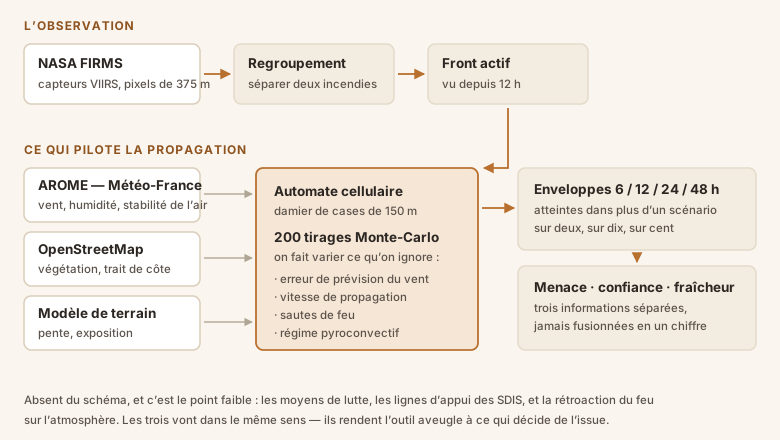
Seeing the fire: FIRMS and VIIRS. NASA distributes, free of charge and in near real time, the thermal detections from its satellites — the service is called FIRMS, and the sensors I use, VIIRS, carve the ground into 375-meter pixels. I prefer them to MODIS, which is older and four times coarser.
You have to understand clearly what a FIRMS detection is: a pixel whose surface temperature is abnormal. Not a fire perimeter. With delays, with gaps when no satellite passes overhead, and nothing at all when smoke or clouds block the view. That nuance governs the whole rest of this article.
Knowing what drives it: AROME, OSM, DEM. Three ingredients move a fire forward. Wind first, which weighs far more than the rest: I take it from AROME, the fine-mesh model from Météo-France (the French national weather service), and not at a single point but sampled across the whole domain — a fire of this size spans several grid cells, and the wind can turn locally. Vegetation next, pulled from OpenStreetMap: a dry pine forest burns, a pond does not, a vineyard barely. Terrain last, through a digital elevation model — simply a file of altitudes — because a fire climbs a slope far faster than it descends one.
Moving it forward: the cellular automaton. The core of the computation carries a learned name for a simple idea.
Cellular automaton — you divide space into regular cells, here 150-meter squares, and you set a rule that says how a cell’s state depends on its neighbors. You apply the rule everywhere, advance one time step, and start again. Conway’s Game of Life is the best-known example.
My rule: a burning cell tries to ignite its eight neighbors, all the faster when the vegetation there is flammable, when the slope rises, and when the wind pushes in that direction. The front spontaneously takes an elliptical shape stretched downwind — which is what firefighters observe in the field, and what models have reproduced since the 1980s.
Accepting that we don’t know: Monte Carlo. This is the point that changes everything.
Monte Carlo method — rather than computing once with the best possible values, you redo the computation hundreds of times, drawing at random, each time, the parameters you know poorly. Then you look at the distribution of the results. The name comes from the casino, and the method from the atomic bomb — Ulam and von Neumann, 1946.
So I run 200 draws. Each time I perturb what is genuinely uncertain: the wind forecast error — which grows with lead time and stays correlated over time, because a wrong forecast is wrong for a stretch rather than every other hour — the error in my own rate-of-spread model, the actual dryness of the fuels, and the occurrence of spotting, those embers thrown ahead of the front that leap across a road or a firebreak.
What gets displayed afterward is no longer a forecast but a tally: this cell burned in 150 of my 200 possible worlds, that one in 3. It’s the same logic as the cone of uncertainty for hurricane tracks.
One clarification that matters: these frequencies are not probabilities in the actuarial sense. They are frequencies conditional on my assumptions. If my assumptions are bad, so are my percentages. Keep that in mind — the rest of the article talks about practically nothing else.
First result: a perfectly motionless fire
First run on real data. The report comes out: new area burned after 6 hours, 103.5 hectares. After 12 hours: 103.5 hectares. To the tenth of a hectare.
A fire that doesn’t gain a single meter in six hours under a 17 km/h wind is wrong. And my 200 draws, supposed to explore different worlds, all gave rigorously the same result — which is even more suspicious.
The cause came down to a choice of index. When I computed the speed of passage from a cell to its neighbor, I took the speed of the source cell, the one already burning. But I mark the whole area already covered as “scar,” with a near-zero rate of spread — which is correct: an already burned zone does not easily burn again.
Except that the fire necessarily starts from the already burned area. All my source cells were scars, and therefore incapable of transmitting anything. The fire was a prisoner of its own perimeter.
The fix comes down to one word: take the speed of the target cell, the one whose fuel is about to be consumed. It’s also more physically accurate — a fire advances at the speed allowed by what it is attacking, not by what it has already burned. Unexpected bonus: it also fixes the crossing of bodies of water, which a flammable source cell could leap across.
Then I looked at the map more closely
The tool was running, the envelopes spread out nicely, the numbers looked plausible. I looked at them for a while before doing what I should have done from the start: open the input map, the one the model uses, and really look at it.
There was a problem. The model was setting the sea on fire.
And it was true. Here is the fuel map — the image that tells the automaton, for each cell, how fast the fire can advance there. On the left what my program saw, on the right the reality:
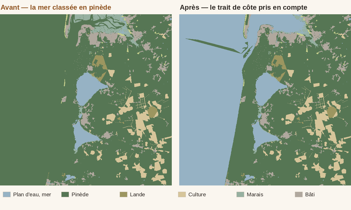
The whole dark-green mass on the left is the Atlantic. Classified as pine forest.
The reason is almost funny. OpenStreetMap does not map the ocean as an area. There is no “Atlantic” polygon: contributors have drawn the coastline — in OSM jargon, a way tagged natural=coastline — that is, a line, not an area. My query, meanwhile, was looking for areas. It dutifully retrieved the lakes, the ponds and the rivers, all polygons, and the open sea matched nothing.
Now, outside any recognized polygon, my program assumes pine forest. That was a deliberate choice: in the Landes forest (the vast maritime-pine plantation covering the southwest of France) the maritime pine dominates, and erring on the side of “it burns” biases the model toward caution. Except that applying that caution to 40% of the computational domain is no longer called caution. On this map, water goes from 3.4% to 40.7% once corrected: more than a third of my working area was flammable ocean.
My first fix retrieved the coastline and used it to cut the domain — perfect on my isolated test. In real conditions, failure: three of the twelve requests to the OpenStreetMap server came back in error, the coastline ended up full of holes, and a coastline with holes cuts nothing. The sea became fuel again.
The right solution lay elsewhere, and it exploits an OpenStreetMap convention: when a coastline is drawn, land is always on the left of the drawing direction. So it’s enough, for each cell, to find the nearest coastline segment and check which side you fall on — a simple cross product. Land on the left, sea on the right. A hole in the data now costs only local precision around the hole.
I only knew my first fix had failed because I had taken care to make the program shout. When it could not reconstruct the sea, it wrote in plain words in its report: “coastline present but unable to derive the extent of the sea from it: the open sea is likely to be treated as fuel.” A model that fails silently lies. A model that fails loudly lets itself be repaired.
The awkward question: does it work?
At that point, the tool was producing pretty maps. A pretty map has never proven anything.
And I had at hand something to catch it out: the fire had been burning for several days, so its own past was available. Rather than waiting to see whether the next forecasts came true, I could replay the ones we could have made two days earlier and see what they were worth. It’s a well-known method, and it has a name: hindcasting.
Hindcast (or retrospective forecast) — you place yourself at a moment in the past, keep only the data available on that date, simulate forward, then compare with what actually happened. It’s the standard way to evaluate a forecasting model when you can’t afford to wait.
So I place myself on the morning of July 24, throw away everything observed afterward, simulate twelve hours, and compare with what actually burned. Then I do it again for the 25th. Two runs, a handful of minutes of computation — and by far the best ratio between effort spent and what it taught me.
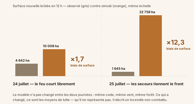
On the morning of the 24th, when the fire was running freely, the model over-predicts by a factor of 1.7. For a spread model, that’s respectable — we’re in the right order of magnitude. On the 25th, as firefighters were regaining control of the front: a factor of 12.3.
What’s interesting is not that the model is wrong. It’s where the difference between the two days comes from. The model did not turn bad overnight: same code, same wind, same forest. What changed between the 24th and the 25th was the firefighting effort.
My program doesn’t see it. It knows nothing of the crews engaged, nor of the control lines — those breaks firefighters open with bulldozers to stop the front — nor of the water drops. So it computes, without my having explicitly decided it, a no-suppression counterfactual: what the fire would do if nobody stood in its way. On the 25th, physics alone gave 22,758 hectares; the fire covered only 1,645, because people prevented it.
There is a consolation in these figures, and it’s an important one. It lies in a measure called the AUC.
AUC, for area under the ROC curve — measures the quality of a ranking, independently of absolute values. If I pick at random one cell that burned and one that did not, the AUC is the probability that the model ranked the first one higher. 0.5 = a coin toss, 1 = perfect ranking.
My AUC is 0.96 to 0.98 in both cases — while the area bias, for its part, varies by a factor of seven. In other words: the model knows very well where the fire is going, and is badly wrong about how much. That’s the best possible failure mode, because a scale error can be calibrated, whereas a direction error condemns the tool.
Which brings me to the least intuitive decision of this whole tinkering. I had a calibration factor ready to go: slow the spread down by just enough to land on July 25. I did not apply it. It would carve into the model the assumption that “suppression always succeeds” — precisely the one you must not rely on in front of a nuclear plant. The tool, moreover, refuses on its own to publish a global factor when its validation cases are too heterogeneous, and explains why rather than averaging two incomparable regimes.
What it doesn’t do — and that’s the most serious part
The worst limitation is none of the ones I’ve just recounted. It comes down to a phrase: the coupling is one-way. Weather drives the fire; the fire never modifies the atmosphere.
Yet a large wildfire makes its own weather. That is pyroconvection: the column of superheated air it sends skyward can rise several kilometers and form a pyrocumulonimbus, a genuine thunderstorm cloud born from the fire itself. It produces dry lightning that starts new fires tens of kilometers away, and it can collapse all at once, slamming a violent gust down to the ground, in any direction whatsoever.
That’s exactly what lets fires we thought contained break loose, and it is independent of the synoptic wind — the large-scale wind, the one AROME forecasts. So it’s invisible to my model. Real fire-atmosphere coupling exists, it goes by names like Meso-NH/ForeFire or WRF-SFIRE, and it requires laboratory-grade computing resources. Out of reach.
The compromise: not to simulate the phenomenon, but to assess its potential. There is an indicator for that, the continuous Haines index, which combines the instability of the air aloft with its dryness — in short, it says whether the sky “acts as a chimney” that day. Crossed with the fire’s radiative power, it gives me a score. A fraction of my 200 draws, equal to that score, then switches into pyroconvective regime: far more uncertain direction, boosted spread, more frequent and more distant spotting. Those draws naturally feed the extreme envelope.
A high potential therefore reads as “the wide envelopes become credible,” never as “this is what will happen.”
Another blind spot, discovered while watching this week’s heat wave roll in. My fine-fuel moisture comes from a classic fire-weather formula, Simard’s, which looks only at instantaneous temperature and relative humidity. It has no memory. Yet three days at 38 °C dry out the litter in depth, and the soil along with it. Hence this absurd result: my model shows a fuel moisture that rises on the day it will hit 39.8 °C. So it underestimates the effect of a heat wave. What’s needed are indices with memory, like the DMC and DC of the Canadian Forest Fire Weather Index, which accumulate the moisture deficit over days and weeks. That’s the next project.
So, the Blayais?
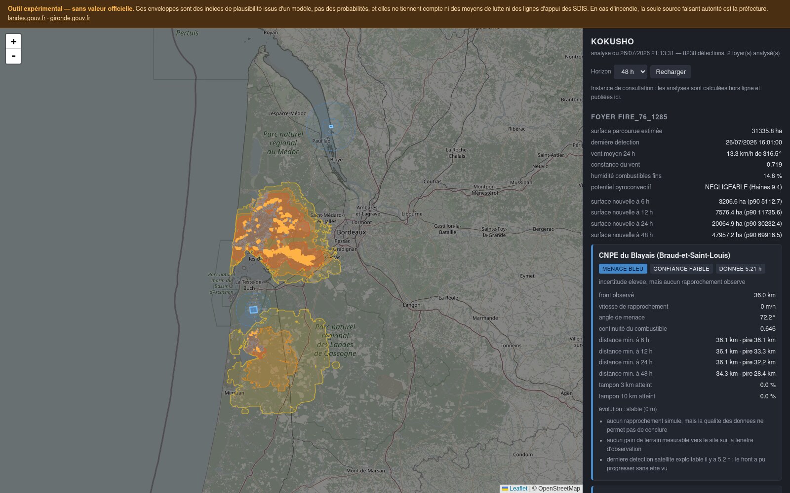
Click to enlarge — or go see the live version at kokusho.ss2i.ca.
The answer stayed the same from the first run to the last: observed front at 36 kilometers, none of the 200 scenarios coming within 10 kilometers, wind pushing the opposite way. The plant was never threatened. And the tool says so with its reasons, not with a verdict.
The site actually exposed was elsewhere: the Cazaux air base, 7 kilometers from the Biscarrosse fire, with up to 6.7% of scenarios reaching its extended zone.
And then there was that last morning when Cazaux abruptly went orange, with 96.7% of scenarios reaching that same zone. Spectacular. And wrong.
The satellite had seen nothing for fifteen hours. My program had fallen back on its fallback assumption: for lack of knowing where the active front is, consider that the entire burned perimeter is active. So the fire was spreading in every direction at once, and my 96.7% no longer measured a convergence toward Cazaux — it measured my ignorance. The actually observed closing speed, for its part, was zero.
From now on, in that specific case, the level falls back to “high uncertainty, no approach observed” instead of crying fire — unless an approach is actually measured, in which case the alert stands. It may be the fix I’m happiest with: it keeps the tool from turning an absence of information into an alert.
What I take away from it
All of this was cobbled together in two days, and I didn’t type the code: I had an AI write it. Same method as for the Czech convertible three weeks ago, but this time on a subject where being wrong is not trivial.
What cannot be delegated, on the other hand, is the rest: deciding that we would display envelopes and never a trajectory, choosing the sources, demanding that the model be tested against the fire’s own past rather than against laboratory tests, and reopening the input map when a result smelled wrong. The machine writes fast and well. It doesn’t know what needs checking.
Five fundamental errors were found in the model. What surprised me most was seeing what caught them:
- the fire imprisoned by its own scar: by an implausible number in a report;
- the rasterization that bogged down: by a computation that never gave control back;
- the flammable sea: because I finally looked at the input map, the one nobody thinks to open;
- the coastline reconstruction that didn’t hold up in real conditions: by a warning I had taken the trouble to write for that precise case;
- the false orange alert: by confronting what the simulation said with what the observation said.
None of them was found by the automated tests. I have sixty-four, and each of these bugs now has its own — they will prevent regression. But no test could have guessed that OpenStreetMap does not map the ocean. Tests check what you have already thought of. They are silent about the rest.
What worked was friction with reality: the real data, the real map, the real past of the fire. Hindcasting taught me more in two runs than two days of development did.
And its main lesson was not “the model is off by this much.” It was: the model does not answer the question I thought I was asking it. I was asking it what this fire was going to do. It was answering what it would do if nobody stood in its way.
That is useful information — it’s even exactly what you need to know what a wildfire is capable of. But it is not what you think you’re reading on a map.
🔥 See the tool online — kokusho.ss2i.ca
Experimental, with no official standing. In the event of a wildfire, the only authoritative source is the préfecture: landes.gouv.fr · gironde.gouv.fr.